Artiswitch as an initial reference
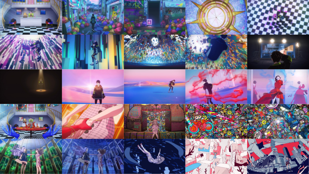
I was initially inspired by Artiswitch due to their use of various settings connected through a single point (the shop), creating a liminal like chain of locations, breaking the boundaries of what should and shouldn’t exist in reality. Artiswitch strongly uses layout and colour to blatantly express different emotions.
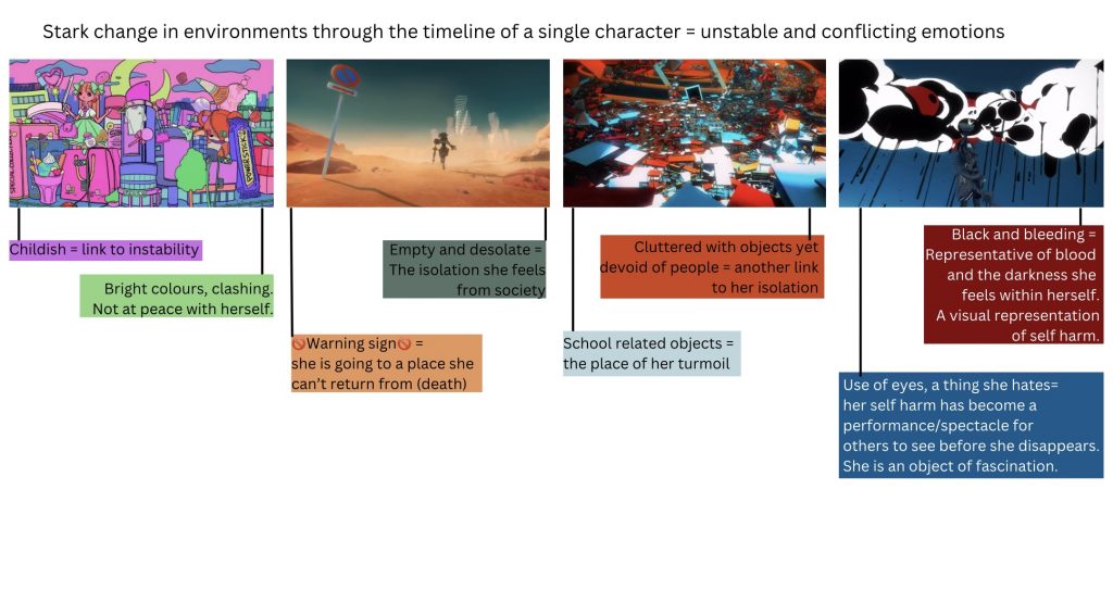
The use of strong visual language helps to tell a clear narrative story, assisting the context given in each episode while maintaining a strong explanation by themselves. As we are aiming to present a narrative, also through different environments, I aim to be able to do the same through my work.
Symbolism research
As our rooms are based around abstract themes we looked into the different means of representing them. As my rooms are Knowledge and Fate I looked for imagery relating to those. I have done so by compiling an asset list.
Knowledge:
- Checkered Floor (chess, strategy)
- books (intelligence, book worm)
- globe (academic, intelligence)
- chess pieces (strategy)
- eyes (all seeing eyes)
- tree (oak -> wisdom)
- owl (Athena -> strategy, wisdom)
- Apple (school – place to learn)
- desk (school, place to learn)
Fate:
- Playing Cards (gambling + chance)
- sword (military/spades/pawn)
- crown (queen/king)
- coins and notes (diamonds card)
- spinning wheel (roulette, gambling)
- dice (chance, random)
- String/Thread (Red thread of love/The Greek Fates)
- Arrow (Cupid -> destiny)
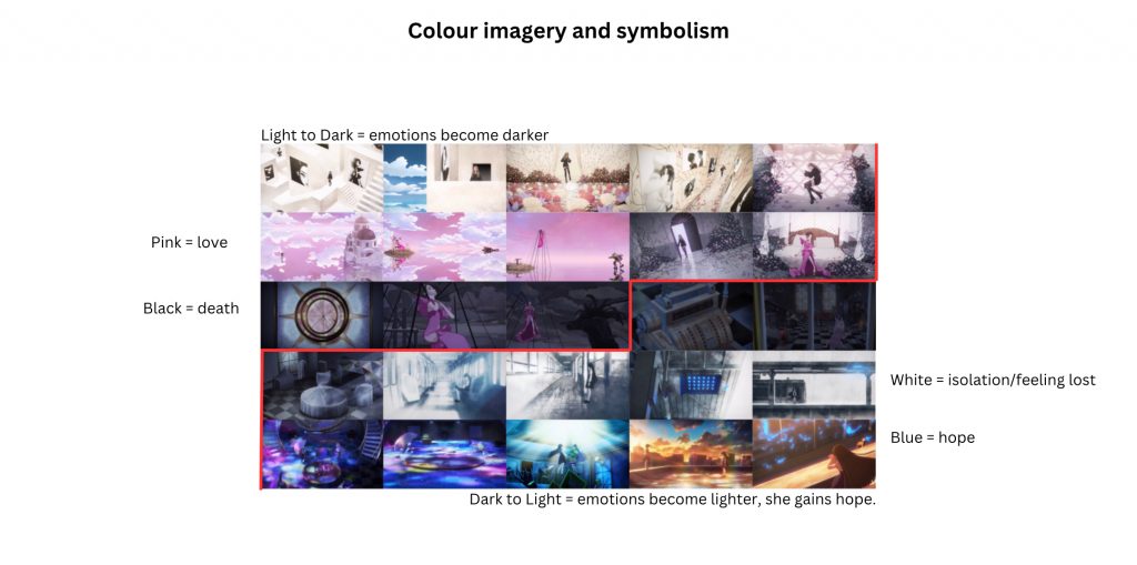
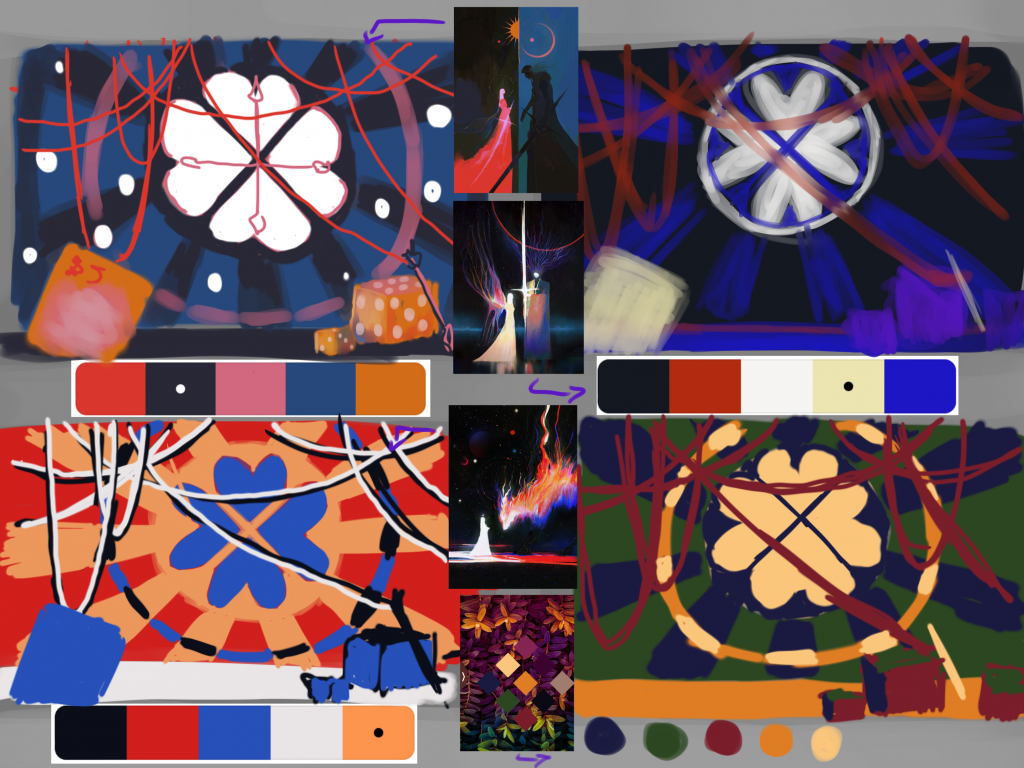
Colour experiments using other people’s colour palettes:
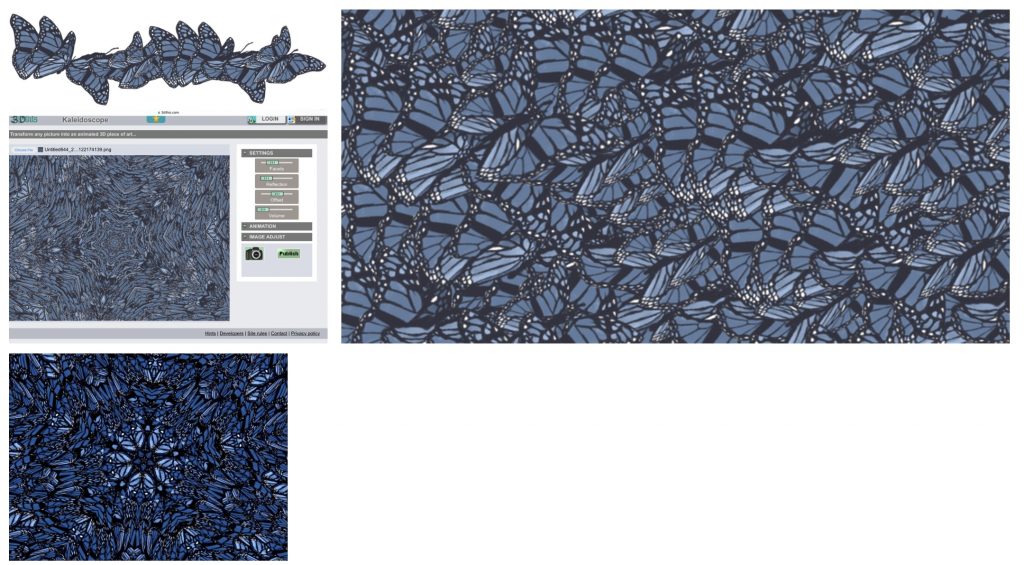
Making of Kaleidoscope backdrop:
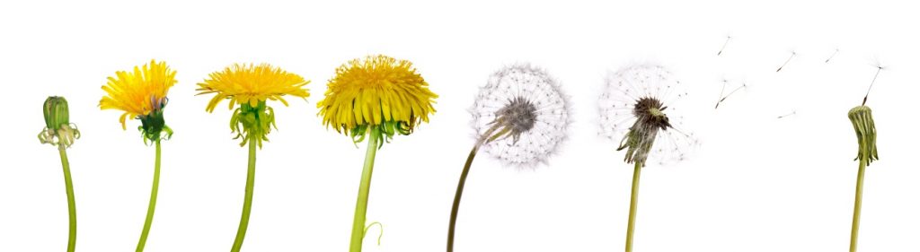
I initially tried creating a short looping animation to go behind the window, inspired by the changing life cycle of a dandelion, from bloom to wilting.
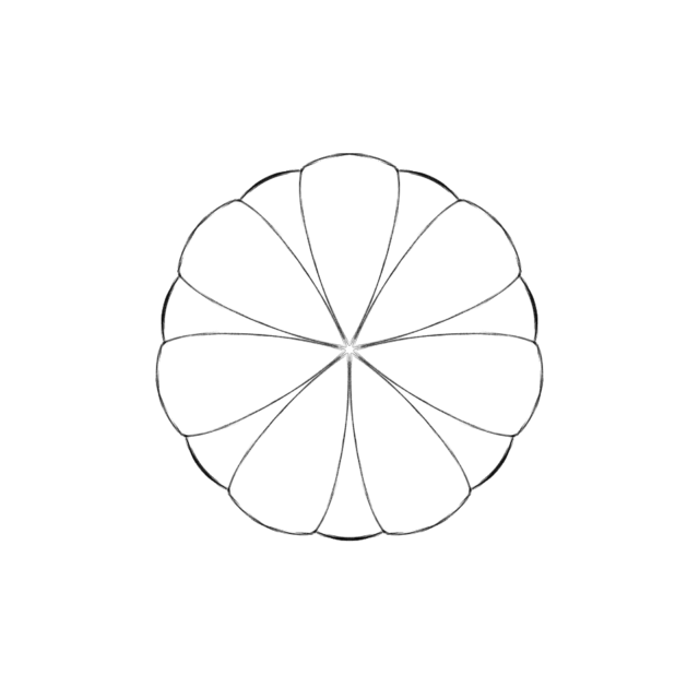
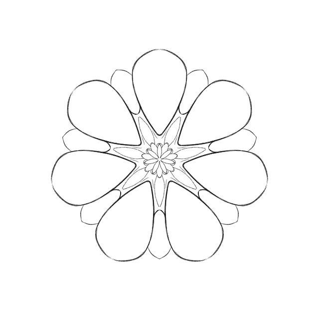
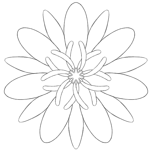
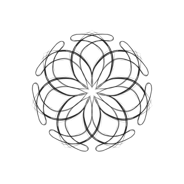

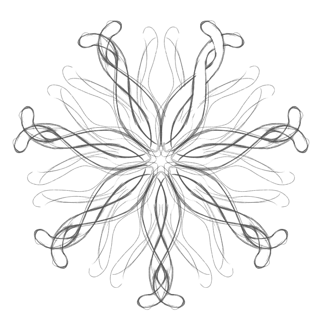

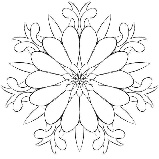
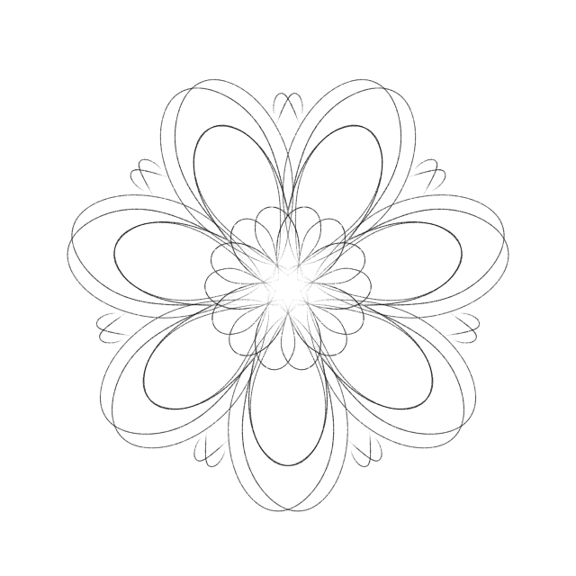
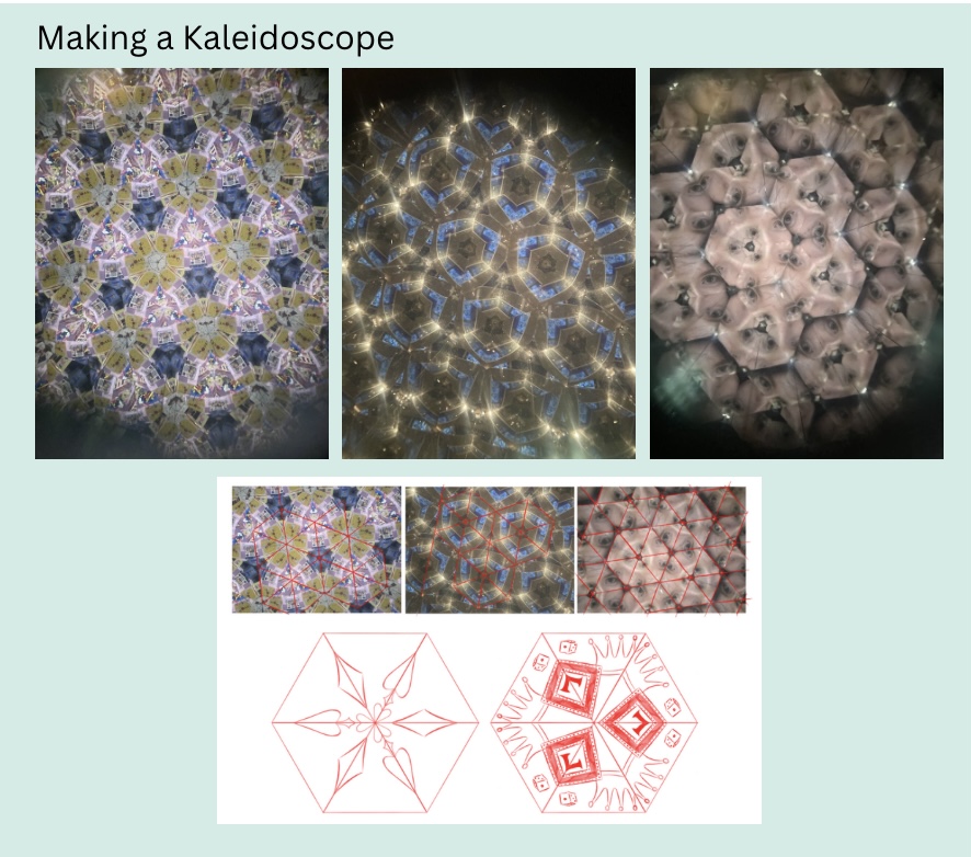
I wanted to put a Kaleidoscope behind my windows. Using some photos I took of a Kaleidoscope from a museum gift shop, I drew a couple of variations but then decided to use a photograph instead using https://3dthis.com/kale.htm as it was also able to create a moving animation. Using the website you are able to easily create a variety of different types of Kaleidoscopic shapes as well as adjust the image’s colours.
To create my image I took Ash’s butterfly animation and copied the frames all over the page till it was completely covered. I chose to do this as a means to connect our work further, in addition to this as the room is fate it could be projecting the destiny/future of the butterfly through the window and what we are seeing is every possibility of the butterfly’s course of action aka every different universe and timeline. By shuffling this image fate becomes mixed up and randomised, you do not know where you will end up or which one is yours as you are not in control of it.
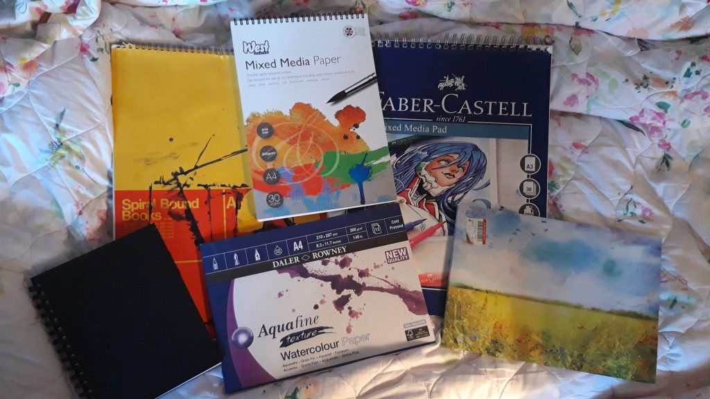
Paint and Paper tests for Knowledge room:
Before painting all my assets I decided to try out different paper and paint options. Unfortunately the paint in tubes had largely dried out or were impossible to open due to being stuck so I was unable to test them, reducing the paint contenders from 4 to 3. I also removed one of the paper options (big yellow book) after realising it was near identical to one of the other options (big Faber-Castell book) due to them both having similar weights and intended for mixed media, however, to make to make up for this I used it for the initial paint comparison test instead.
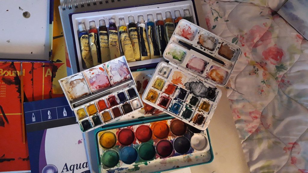
Water colour tests:
To make it as fair as possible I used the closest shades they had to each other in order to justly compare the different pigments which would have been made harder had I compared mismatched shades. Ultimately I chose to use the third option, Winsor & Newton due to the softness of the pigments and needing to build them up more. Ordinarily you would want to use the strongest pigment, which in this case was number 2 (Van Gogh) but as I was aiming to mimic Beatrix Potter who has a very delicate style, the softer pigments were more ideal as it would give me more control over the pigmentation, albeit take a little longer.
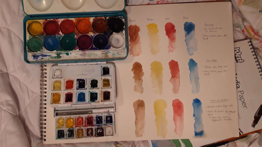
Paper tests:
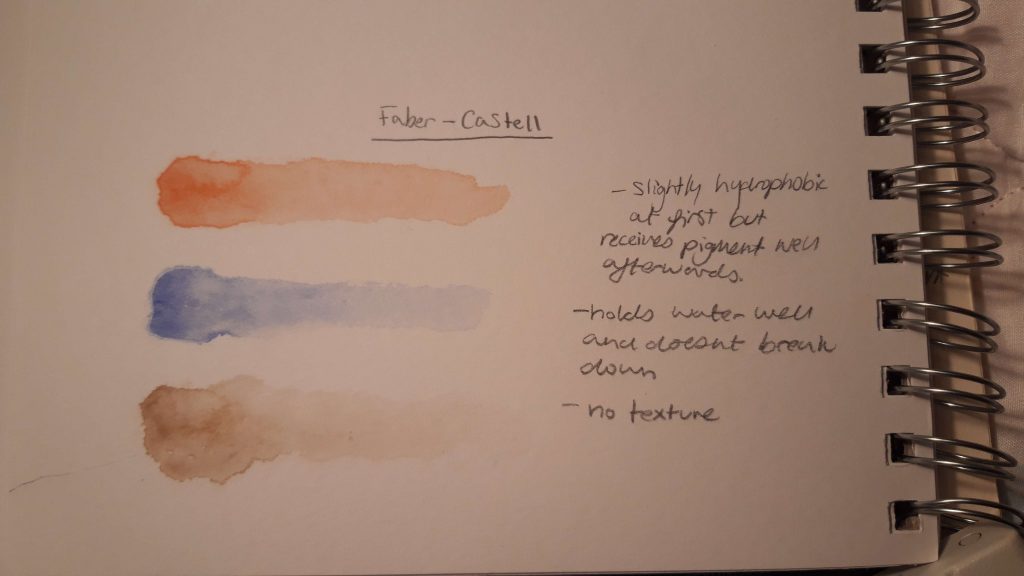
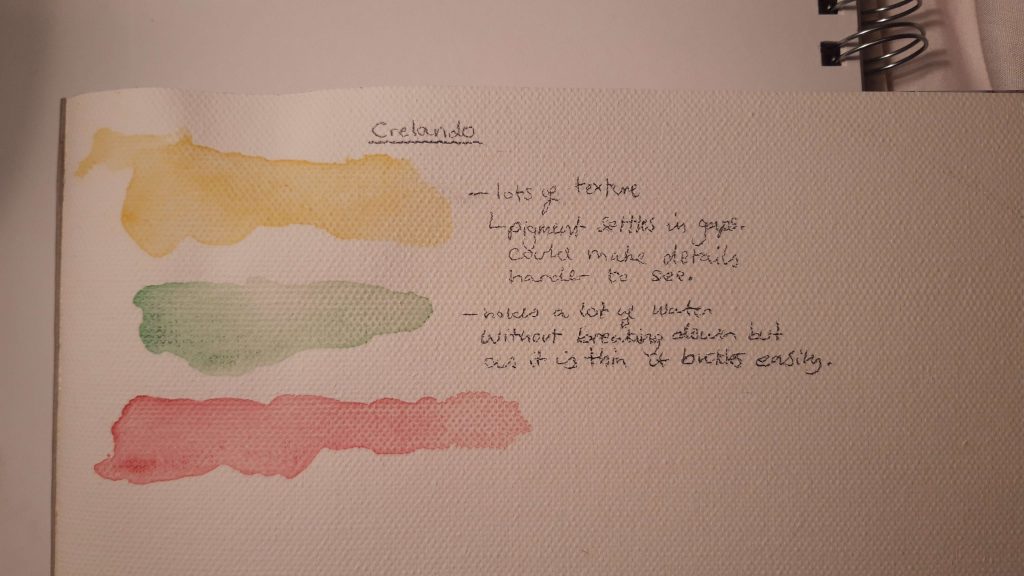
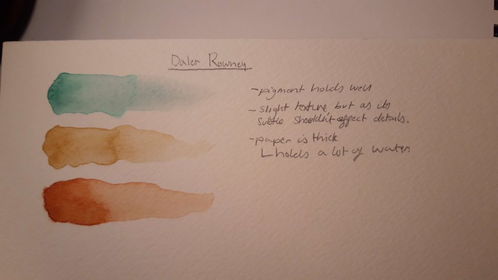
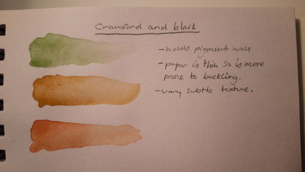
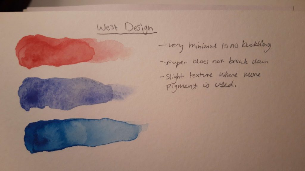
Using the winning paints I tested different colours on different paper. As I was not comparing the pigment, but rather how the paper reacted to it, I decided to use as wide a ray of colours as possible as it would further help me to familiarise myself with the winsor and newton paints again.
Feedback and further experimentation
Throughout my project I frequently asked for the opinion of others to help in certain design aspects, which then influenced the direction of which my project took.
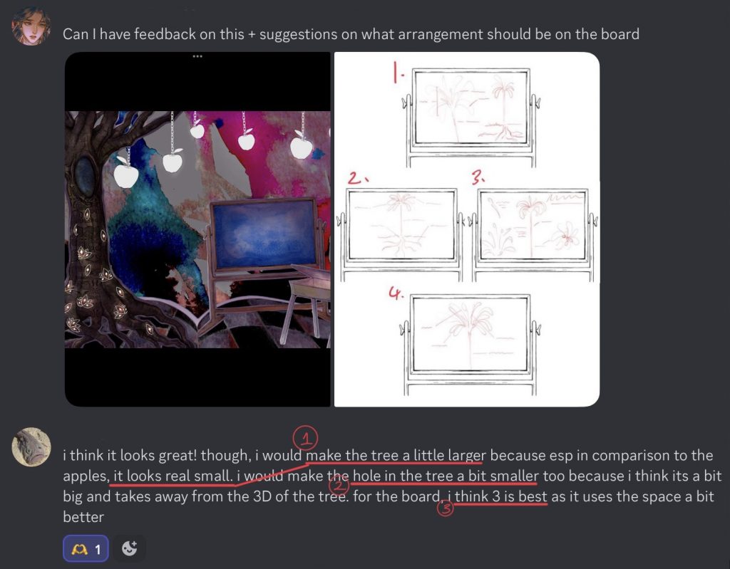
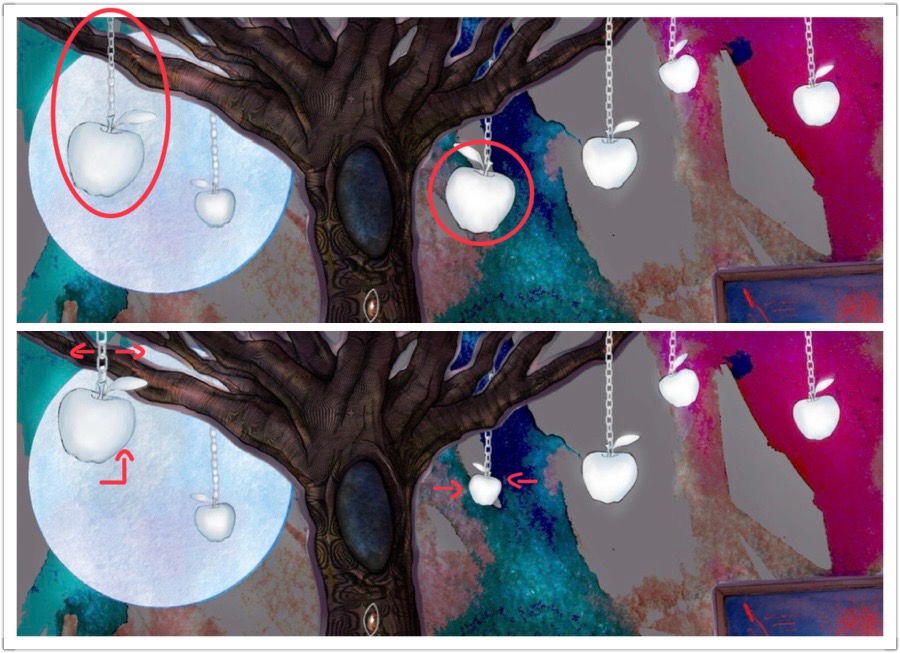
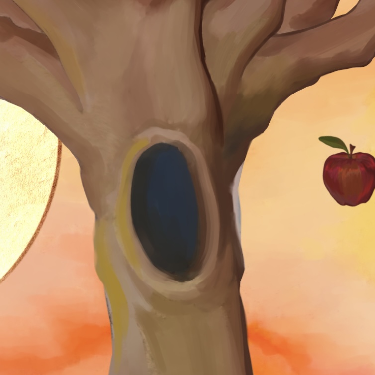
- “Make the tree a little larger”
In order to make the tree appear larger, I changed the sizes of a couple of the apples in order to change the scale as well as fix some of the perspective issues. To do this I changed the height of one of the apples as well as enlarged the chain so it would appear to be closer in front and for the other I shrunk the apple down as a result, moving it higher up.
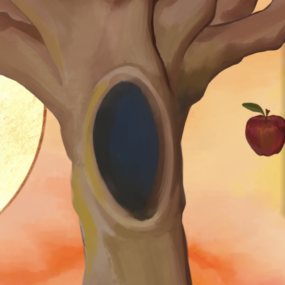
2. “Make the hole in the tree a bit smaller”
I received this feedback from numerous people and while I had intended to originally place an animal inside, without it, it seemed excessively large, and as others had pointed out, took away focus from the rest of the tree. To do this, I resized it using a manipulation brush, meaning I was able to save a lot of the brush strokes I’d already done and only had to patch up the now missing side to the tree.
I only had to do this process to one of the 2 knowledge rooms as I placed an eye in the other hole in lieu of leaving it empty.
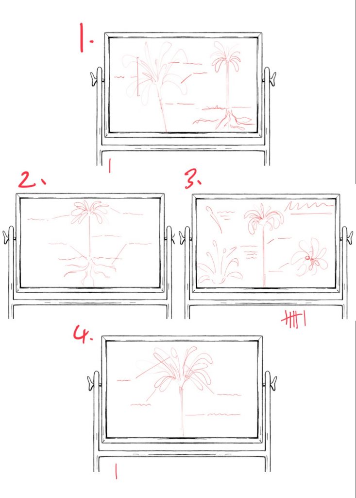
3. By asking a range of people I was able to gage that the third option was most popular, reasons being it filled up the space the best, they simply liked the details included on it, or it made it look the most scientific. I also received feedback encouraging the use of the first layout in case it would look too overcrowded but as the blackboard was appropriately sized I do not think that was an issue.
To be wary about placement bias (people choosing an option based on where it was on the screen) I shuffled them around between asking different people.


When designing my arrow for my Fate room I created a series of iterations and consulted the opinion of others to help me narrow down the selection of which to pick.
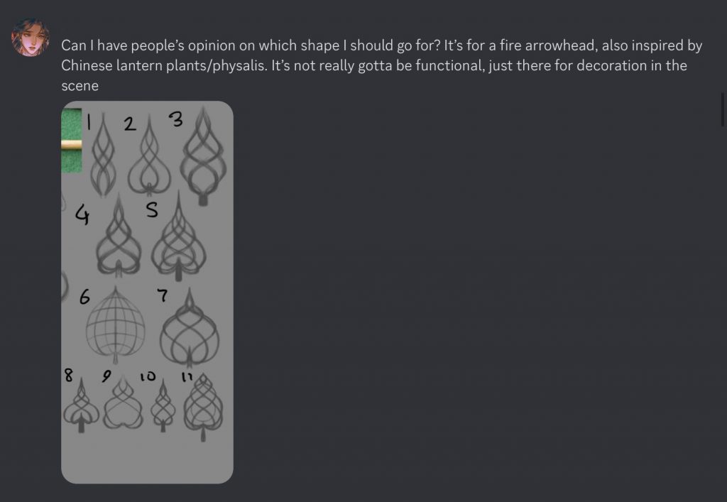
- While one of my references for creating my arrow was the Chinese lantern plant I did not intend it to be obvious through my drawing and so I did not have to take this into consideration, however, their point was reaffirming when they mentioned that some of my designs looked like the suit of spaces (3) which was my intended reference point.
When requesting feedback I had intentionally left out certain details of my project. While this may prevent me from receiving specifically tailored feedback I wanted to first find out their initial ideas surrounding what I had showed them without influencing their opinion as I would always be able to clarify my design choices afterwards. By doing it this way I was able to find out that one of their natural responses was one I had intended, without giving them any information relating to playing cards. - While in reference to the lantern plant again they brought up a very relevant point of what I needed to avoid which I took on board for future iterations for various assets.
4. Like with the blackboard, it was brought up if there would be too much information for the asset’s scale. In this instance I agree as the arrow is on the smaller side as well as the fact that it will have parts erased between the bars, meaning it may be easy to get it lost inside the background whereas I need it to stand out and be visible. Because of this I opted to choose one of the simpler designs which had more clarity. Ultimately that ended up being 8 as that also had a good reception as well as aligning with all prior feedback.
Animation experiment on CapCut.
When I did not have access to a computer or laptop I attempted to recreate my animation using CapCut. Unlike on After Effects where you are able to use the rotation command to keep an object spinning at a constant rate, I used only key frames and manually rotated the object in between each time which was very labour intensive and was a far longer process, however, this was primarily because I had to keep re-centring the wheel as it began to drift away from the hole. I actually ran into a similar problem in after effects which I ended up solving the same way- using key frames to keep putting it back in place. This isn’t very efficient and so when it came time for me to animate the arrows spinning on after effects I recruited the help of my partner, Ash, who had successfully managed to get several cogs spinning in place, to help me keep my assets in place. While I ran into similar problems on both programs, After Effects is far more efficient due to its easy commands, however, I wish it was easier to find features such as how to change the anchor point of an object as the method I used still caused the object to wander away but that may have been in part due to the speed settings.