3D Project
IP Research
I chose Onmyoji as my IP as I was inspired by the vibrant colours of some of the designs as well as understanding how they have translated different folklore characters into game characters. As a lot of the human like characters lack individuality and can come across as having the same face I opted to look at the non human characters, or those with very exaggerated features as opposed to the very standard ‘anime art style’ used with their human counterparts.
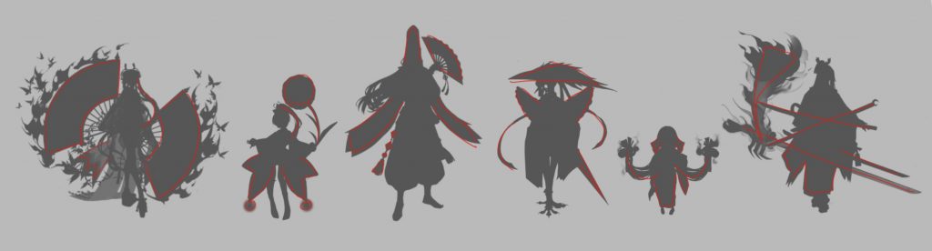
Onmyoji differentiates each character through silhouette very well through a mixture of body language & pose, clothing, and accessories & weapons. Drawing over the silhouettes helped me to highlight what parts my eyes were drawn to and how those features are used to tell each character apart. When creating my own silhouettes I will aim to use shape language in a similar way. For my design I can use this to think about how I can incorporate distinct shapes into the storytelling of my character (what would they want to show off vs hide).
Over the course of its running, Onmyoji’s colour palette has shifted to a more gentle and muted range vs the quite striking and eye catching range previously used. For this project I want to focus on the old colours used as they’re quite attractive and are what I personally feel identified a lot of Onmyoji’s brand.
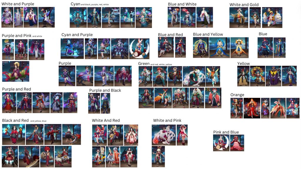
I took screenshots of what I considered to be the most nostalgic designs then categorised them based on the colours used. The point of categorising them was less to do with pointing out every single colour palette used by Netease but rather to highlight specific colour combinations and to observe the different ways the colours were used. By laying the images side by side I was able to pinpoint similarities with the placements as well as the other minor colours used.
This helped me to generate different colour palettes for my character as it showed me how different colours could work together, especially contrasting colours like blue and yellow.
Wolves and Foxes in Japanese mythology
Within Japanese culture and mythology wolves seem to take on the role of a protector and guardian, being a messenger of the Kami spirits. One such example is Okuri Inu The Escorting Dog – a spirit who follows lone travellers through forests in the night til they get home. Or the story of wolves warning a Hongū village in 1889 about a flood by howling continuously the eve of. This reputation greatly contrasts the western characterisation of wolves as villains, evident in fairytales such as ‘Little Red Riding Hood’, ‘The Three Little Pigs’ and ‘The Boy Who Cried Wolf’, all of which result in the wolf bringing along some sort of tragedy or misfortune.
Contrastingly Foxes within Japanese folklore, or rather specifically Kitsune, are heavily associated with trickery and transformation with notable figures including Tamamo-no-mae and Kuzunoha. Despite having a strong representation as tricksters these examples present Kitsune as civilised and loving, showing a duality in the types of spirits.
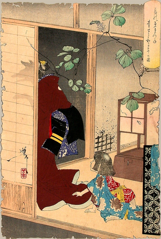
Yoshitoshi (1889-1892) The Fox-woman Kuzunoha Leaving Her Child.
Japanese Noh Theatre
I am thinking about different ways my character could deceive and lure victims closer and was inspired by the idea of my character wearing masks to cover their true face. I was inspired by the use of masks in Noh theatre vs the face paint in Kabuki as masks are able to change the facial structure vs paint only working as an illusion with contouring. As my character is an animal I feel the use of a mask would be more convincing.
The use of different theatre masks could tie in to my character playing different roles when luring in different people, such as the role of a young child or a helpless old lady.
I will use this research to determine the roles my character will play.
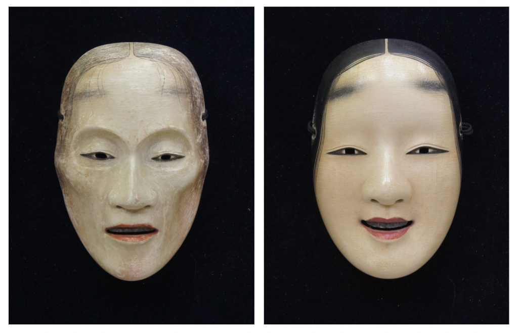
In Noh theatre there are a range of different characters including Okina, Kojō, wakonna, rōjo and hannya, each with a different age, gender or background. For my character I decided to look at Rojo (thin old lady) and Onna (beautiful young woman) as I feel people may be more likely to help one of them playing on the idea of them being weaker or perhaps more helpless.
Clothing Inspiration
https://www.shizukuya.com/collection/2017/autumn/
https://www.shizukuya.com/en/collection/2022/winter/
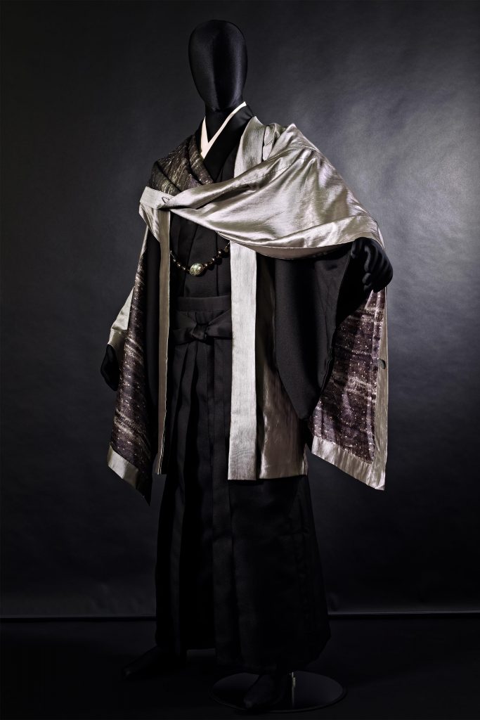
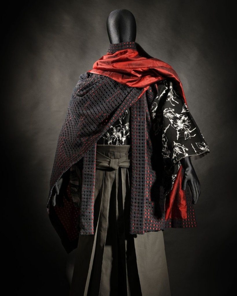
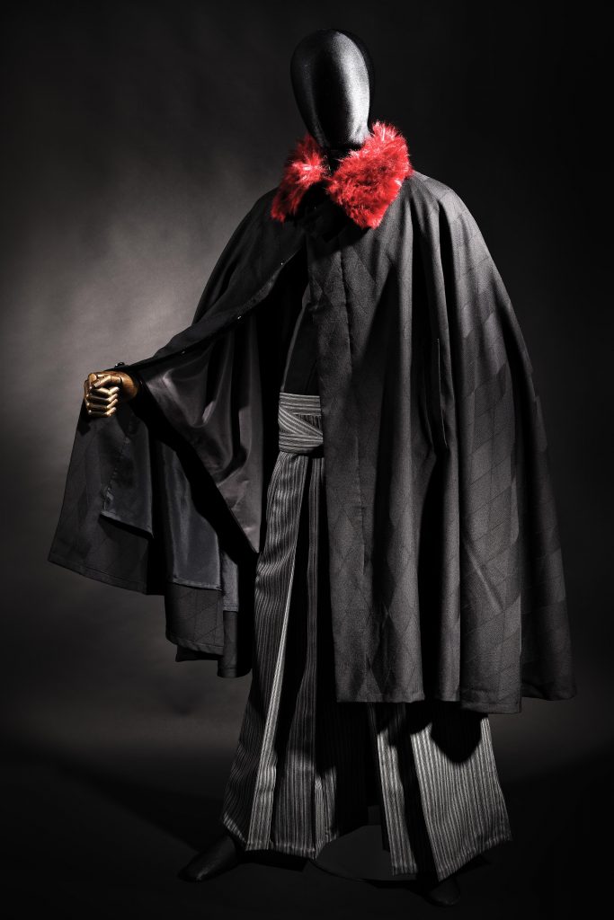
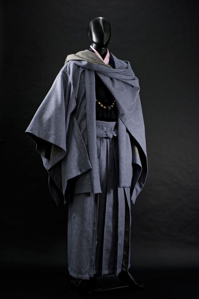
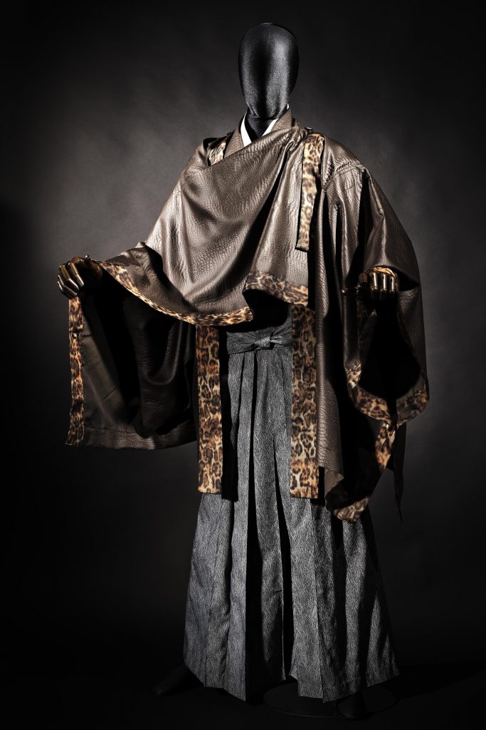
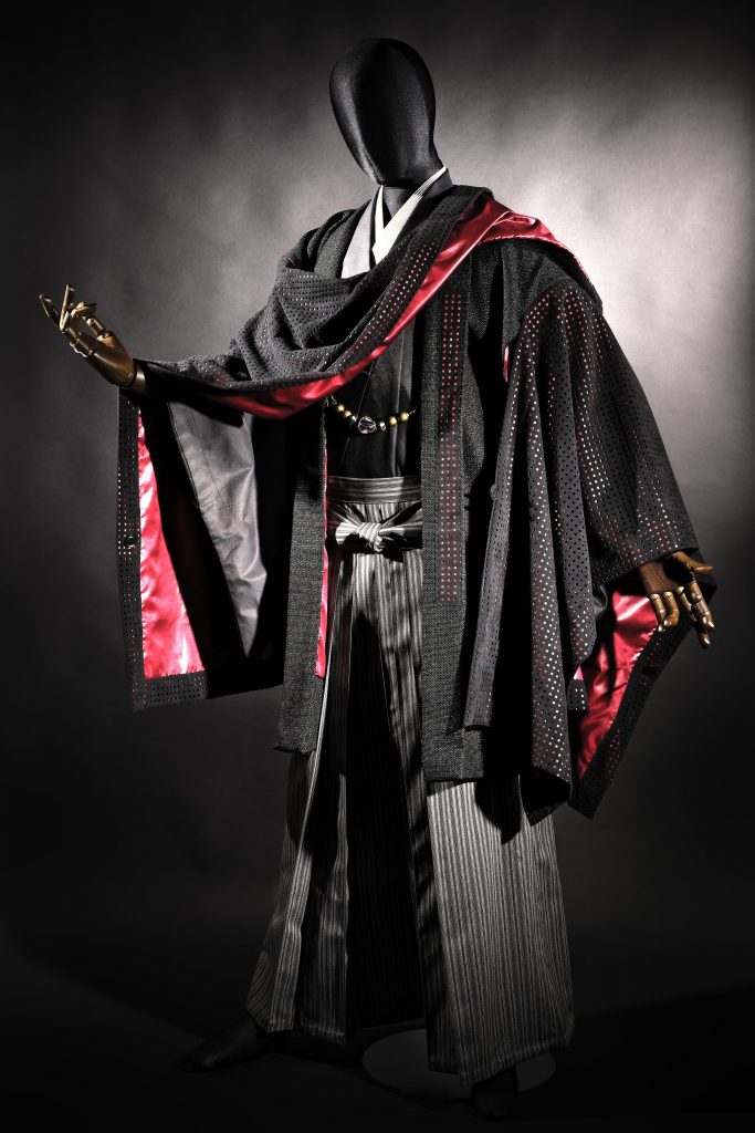
For my fairytale inspiration I decided to go for little red riding hood and was immediately drawn towards these collections of Samurai coats by Wazigen-Shizukuya upon finding them. While they had some with hoods I preferred the hood less designs as I didn’t want to cover my character’s ears as they are a defining part of the silhouette. One of the features I like about the capes are how they wrap around the body over the shoulder and have a sleeve on the opposite side, as the asymmetry makes the design feel more balanced and interesting.
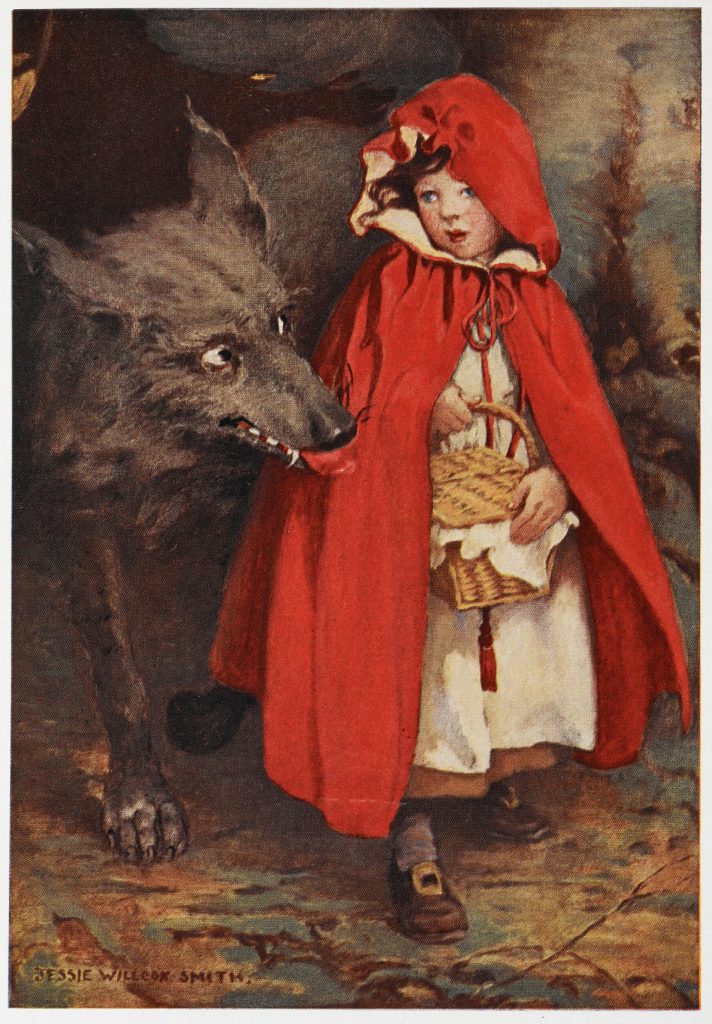
Little Red Riding Hood as illustrated by J.W. Smith (1911)
Structure Analysis
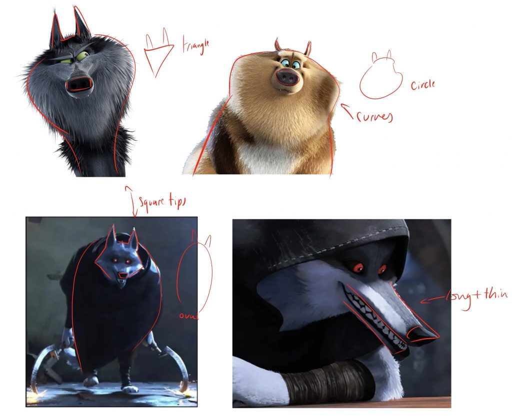
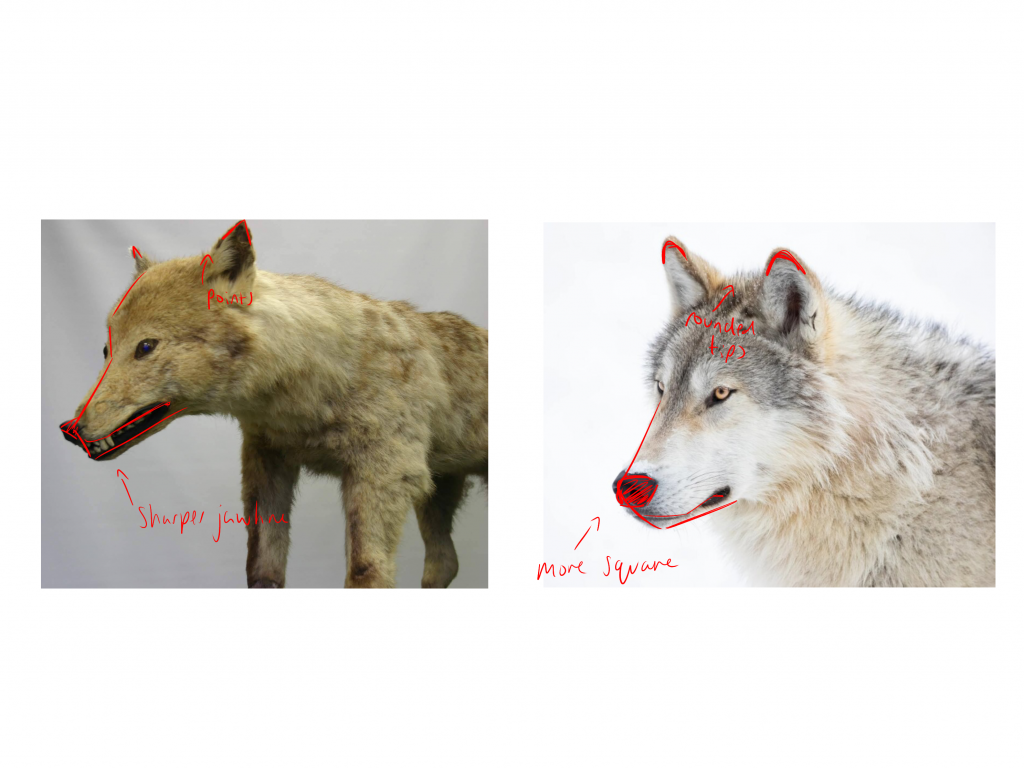
As I decided to make my character a wolf I decided to observe different media depictions as well as comparing the extinct Japanese wolf to the current wolf. By doing this I was able to highlight the key shape differences with the Puss in boots wolf (bottom) and Japanese wolf having sharper and thinner features than those from Storks and the modern wolf. When sculpting my character I want to include some of those sharper features instead of the more square and dog like features.
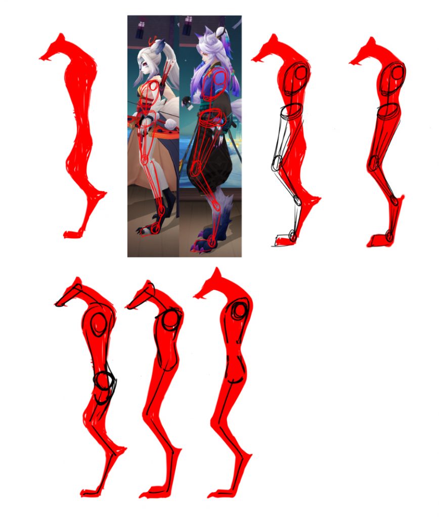
After exploring silhouettes I chose my favourite to then transform into the final body shape. I traced over 2 of Onmyoji’s humanoid animal characters to understand their proportions and apply it to my own drawing. This helped me to see how extensively long my torso was. While this had been a stylistic choice to exaggerate the figure it made the legs look excessively short which was not the desired effect. However, in comparison Onmyoji’s torso’s seemed too small so I compromised by stretching it out while keeping the legs the same length
Model development
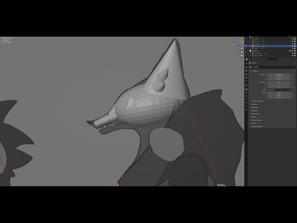
This was my attempt at using Blender to create the base mesh. I later scrapped this when I moved to Maya.
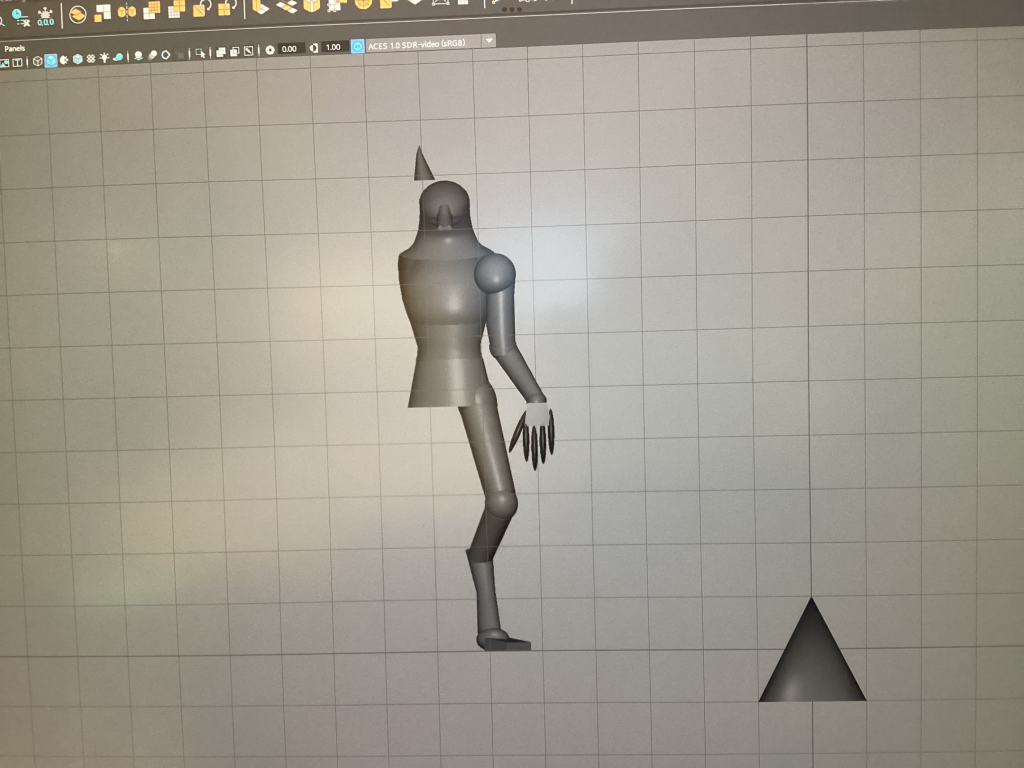
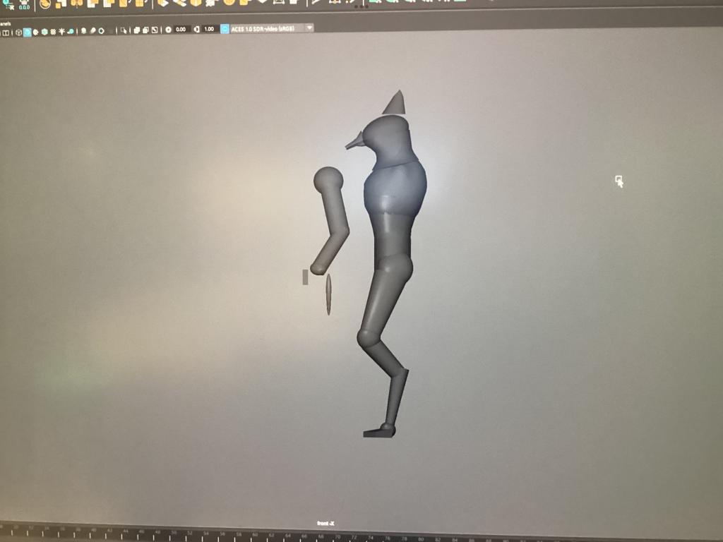
This is the start of my model in Maya. As you can see, I had spent a lot of time changing the shapes to match the silhouette.
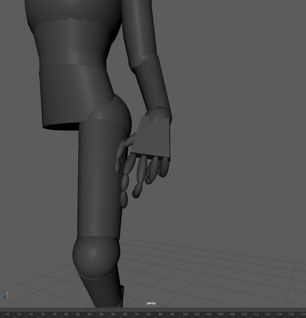
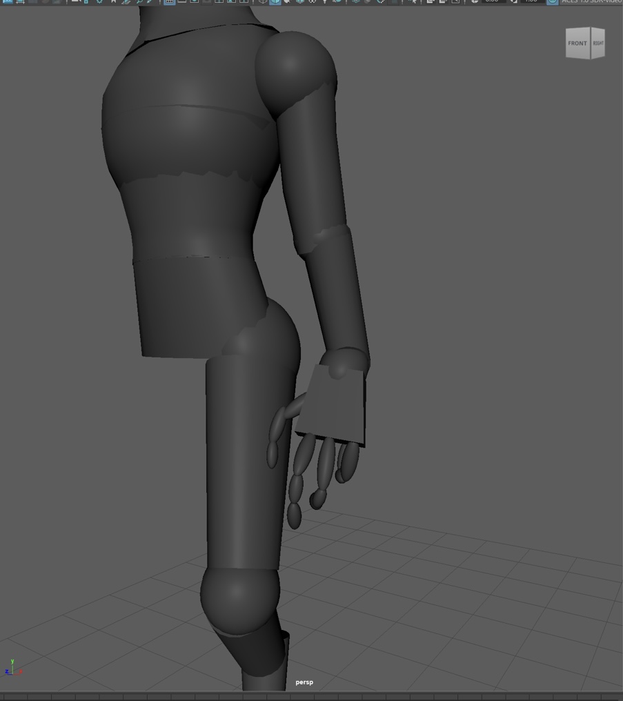
I started of by giving my model 5 fingers however upon discussing it with the teacher decided that 4 made the hand look better as with 5 it looked somewhat cramped and unnatural and 4 fit better.
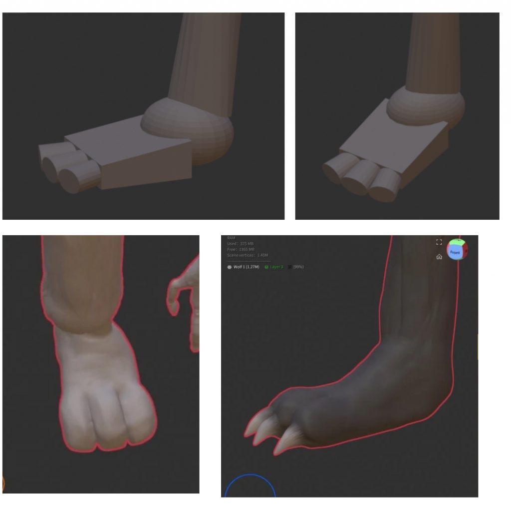
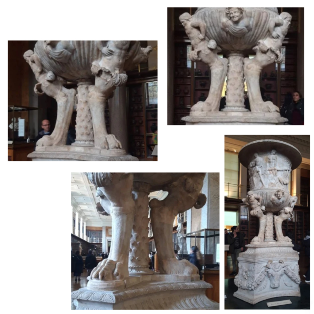
During the sculpting process I struggled a lot with the feet and how the toes should look. I visited the British Museum and saw this Piranesi Vase with animal paws sculpted on the bottom. Seeing it in person helped me to understand how the paw is structured so I took photos from different angles to use as reference later on. This helped me better than the references I found online as I was able to view it from different angles. It being a physical sculpture also helped to define every individual part in comparison to photos which sometimes appear very flat. I looked around several other sections of the museum for other references including drawings and painting but unfortunately didn’t find anything useful. This would have been useful in informing my practice by introducing me to different interpretations but thankfully as the vase was a 3D object I was able to rotate it in comparison to what I would have been able to do with a painting. As my character is humanoid I modelled my paw after a foot and made it much longer than my reference however I was able to reference the toes and claws like I had hoped to. Before this reference I had been making the foot too wide, making it look un-proportional to the rest of the character. Instead of building the toes around the rest of the foot I built the rest of the foot around the toes which helped to keep everything sized reasonably.
2D Project
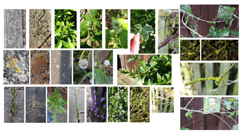
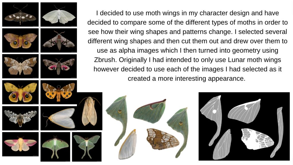
After creating my moodboard I walked around my neighbourhood and took photos of different plants to give me ideas for different textures and shapes I can unclouded in my own model. I’m especially inspired by the sharp and thorn like twigs as well as the repetition of spheres and circles found in the many different forms of nature.
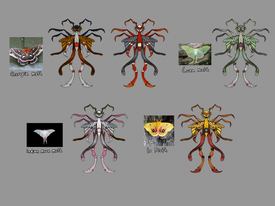
To help choose my colours I selected several different moths and selected colours based on their markings, trying to lay them out in a somewhat similar pattern.
body inspirations
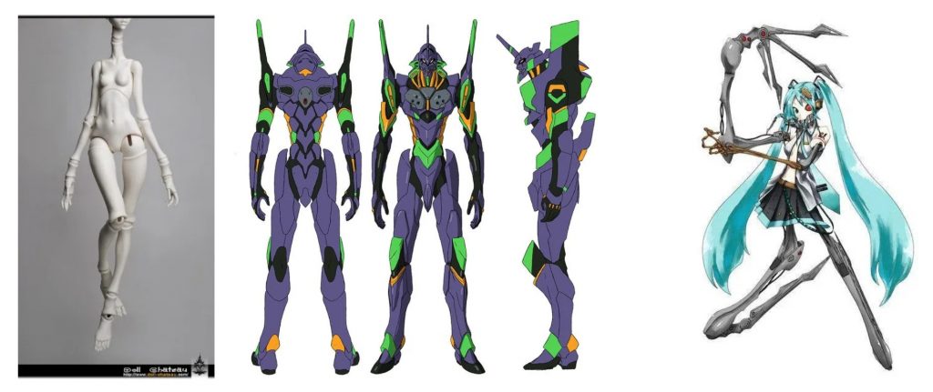
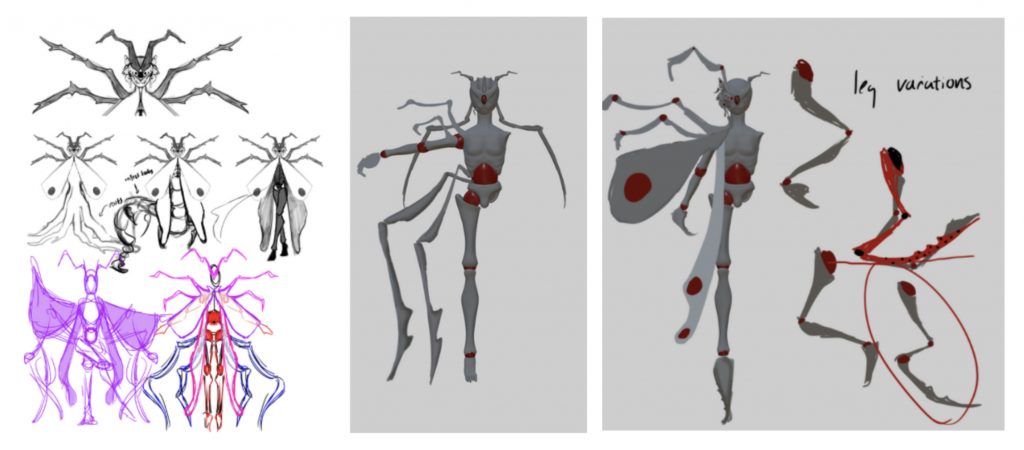
I was inspired by ball joint dolls, Neon Genesis Evangelion’s mecha robots and Deino’s Calne Ca for their distinctive body types and silhouettes. I wanted to build on the body structure of insects being quite fragmented and combined it with the ball joints seen in ball jointed dolls and the Eva robots. The exaggerated parts of the Eva robot design such as the extending shoulders and horn reminded me to copy my original drawing more closely and exaggerate the features I had started to make quite unnoticeable. Drawing over my model helped me to explore the ideas I had and visualise it on my model. This helped me to decide which direction to head in without sculpting everything And therefore saved time as I ended up deciding against certain design choices I previously thought would work but then realise made the design look too overcrowded. I explored different leg ideas, inspired by Calne Ca’s design. Previously I had intended on using human legs and feet and had sculpted them as such but then realised I should lean further into my character being of insect origin.
One response to “23/24 Games Art Pipeline”
nice 😀